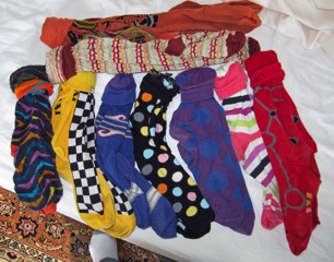
socks of distinction create websites of wonderment
I trust that all is well and that you are healthy, wealthy and happy. Here in Zürich, we’re getting ready for a quick trip to the United States. We will see Mitra (with Stefan) and Melika (with Tom) in California this weekend. Then we’ll head to Santa Fe. Preparing for the trip, Nazy was making a list clothes to bring. As she surveyed her countless choices, I remarked on my own sartorial splendor:
“Look at this, Nazy,” I exulted. “I’m trendy.”
“You?”
“There’s an article in The International Herald Tribune about socks. (see here).”
“Socks?”
“Right. Bright colored, e.g. pink and orange, and outrageously patterned socks are ‘in’.”
“Your wardrobe is ‘in’?”
“The colorful socks that I’ve been wearing for years are now a badge of honor for Silicon Valley geeks and execs.”
“You wear them because you’re colorblind.”
“Colorblindness is common in Silicon Valley, my dear. I am responsible for an entire trend.”
“Responsible?”
“Solely responsible, my dear. I created the trend while I was with HP on the ING account.”
“I thought that ING was cowboy boots and hats.”
“Hmm. You may be right.”
“Do they wear cowboy hats and boots in Silicon Valley?”
“Unlikely. Boots would hide the cool socks”
“Could it have been your ties?”
“A TV newscaster actually interviewed me about one of my ties,” I thought.
“They don’t wear ties in Silicon Valley: tee-shirts and jeans are the uniform of geekdom,” I replied. “In fact, bare feet or sandals are de rigueur.”
“Barefoot means sock-less.”

“Don’t rain on my parade. I started the craze of colorful hosiery.”
“Just don’t wear your ‘bear shirt’ to a business meeting.”
In passing, I note that I also have a red sports jacket and a (few) pairs of somewhat unusual pants. Enough about my elegant closet.
Enough about my elegant closet. On to my equally elegant website: www.seat26b.com. which was constructed using Apple’s iWeb software. Like all Apple products, iWeb is effective, simple and easy as long as you’re happy doing exactly what Apple desires. Two major developments since the website began:
I’ve outgrown iWeb.
Apple will discontinue iWeb
In a search for alternatives, I tried Wordpress. (See my initial attempt at www.danmartin.ch.) The Wordpress (open-source, free-for-all) approach is completely different from the iWeb (closed, controlled) environment. It’s sort of like switching from European football (i.e. ‘soccer&rsquo![]() to American football (e.g. Why isn’t the ball round?).
to American football (e.g. Why isn’t the ball round?).
In theory, Wordpress solves all my problems. It’s free. There are a million themes (which define the ‘look&rsquo![]() , thousands of plug-ins (which provide additional features) a myriad of gadgets and a plethora of add-ons. Of course, some themes don’t work with some gadgets, add-ons don’t work with every plug-in. Anything is possible - if you have the coding skills of Mark Zuckerberg, the patience of an Easter Island statue and the perception of the Oracle at Delphi.
, thousands of plug-ins (which provide additional features) a myriad of gadgets and a plethora of add-ons. Of course, some themes don’t work with some gadgets, add-ons don’t work with every plug-in. Anything is possible - if you have the coding skills of Mark Zuckerberg, the patience of an Easter Island statue and the perception of the Oracle at Delphi.
Aware that I have the coding skills of the statues in Easter Island, the patience of great white shark eying an injured sea-lion and the predictive skills of George Custer, I decided to purchase an integrated commercial package. Internet research directed me to Rapidweaver, a remarkably inexpensive application that (purported to) support everything I wanted to do. As I tried it out, I discovered that I wanted more flexibility: I (purcha$ed) an add-on - and then another. (It wasn’t fr€€.) I £iked a commercial theme, but after installation I discovered that a (¥ikes!) plug-in was mandated. (I noticed that the ‘in’ in inexpensive had vanished.)
Rapidlyweaveing on Nazy’s site (www.paintingadventure.com), I created a new look and showed Nazy the results.
“Well?” I asked fully expecting enthusiasm and excitement.
“What’s different?” Nazy replied.
“Look at this,” I retorted. “I’ll show her how easy it is to give it a completely new look by changing the theme,” I thought as I clicked
on a new color scheme.
“Look at what?”
“It’s completely reorganized and restructured. New colors, new..”
“I liked it the way it was.”
“Your paintings are color-coded.” I clicked again
Maybe, but the color and layout are ugly. Can you fix it? Write a program or something.”
“Can I fix it?” I thought. “Write a program? I feel like I’m back at Georgia Tech.”
I had chosen a professional design because I lacked confidence in my own layout and color selections. I conclude that the colorblind professional who designed it wears brightly patterned socks.

